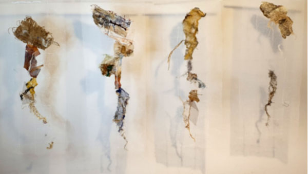
Below, Patti Taylor, a new member to Phoenix, shares her thoughts on her recent creative adventure:
I had an idea … an abstracted landscape/aerial view of Spurn Point, overlaid with images of derelict buildings and detritus from the war. These would be delicate, perhaps on silk or other transparent fabric, showing how everything was fading and disappearing. An image in an old notebook which had since been turned into a mixed media picture was my starting point.

I sketched out my ideas, as best as I could, before starting work on how to transfer these images onto fabric. I trialled various transfer methods: acetone, citrasolv, printing directly onto fabric with a laserjet and using an inkjet printer. The chemical methods were the closest, but none of them gave me the result I wanted for this work – an image suitable for “floating” in front of the main hanging.
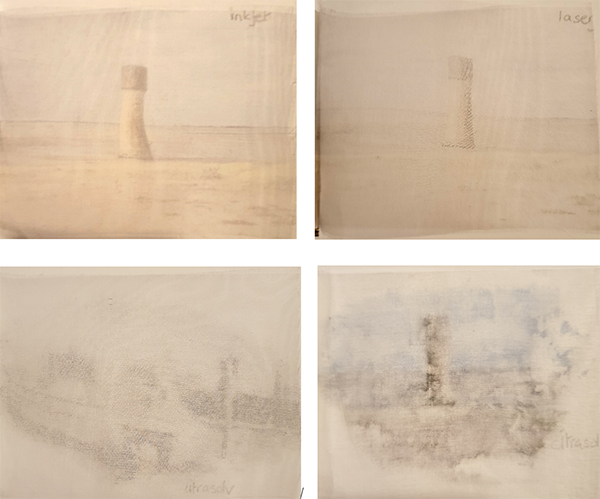
I had long wanted a heat press, and around this time saw a good deal on Black Friday – I was in! I found my old notes for sublimation printing (and had a quick check with Louise Baldwin, my lovely past tutor from CityLit) and I was away. Or – not quite yet. I had underestimated the size and weight of this piece of kit and as a result it sat in its box at the bottom of the stairs for nearly a month, waiting for younger, stronger family members to provide the muscle to lift it to my upstairs workroom. That wasn’t the only issue; finding it a permanent position required a considerable amount of shifting and moving of existing equipment but eventually it was set up and ready to go.
Then there was the issue of media and consumables. A few years ago I’d been given a load of old transfer dyes and had papers from past courses, but couldn’t find them. (My workroom, it has to be said, is overstuffed.) Then I remembered: I’d passed them on to the textile students at my old college. I thought it would be easy to buy some more – perhaps from Amazon … but could find none. I asked fellow textilers in Phoenix, who offered their own materials – but then, typically, I found some unused dyes and crayons on my crowded shelves.
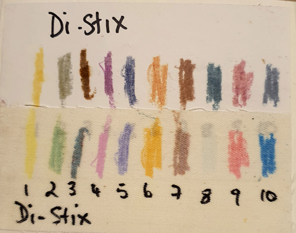
More sampling. I tested by transferring onto photocopy images and printing directly onto fabric. This didn’t work either. The crayons were too dark, and the transfers from photocopies too indistinct. It didn’t help that I wanted to print onto natural plasterer’s scrim rather than synthetic, but I had treated it with Transfix, which I also found in my stash!
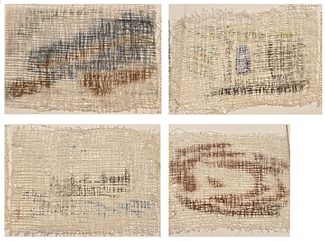
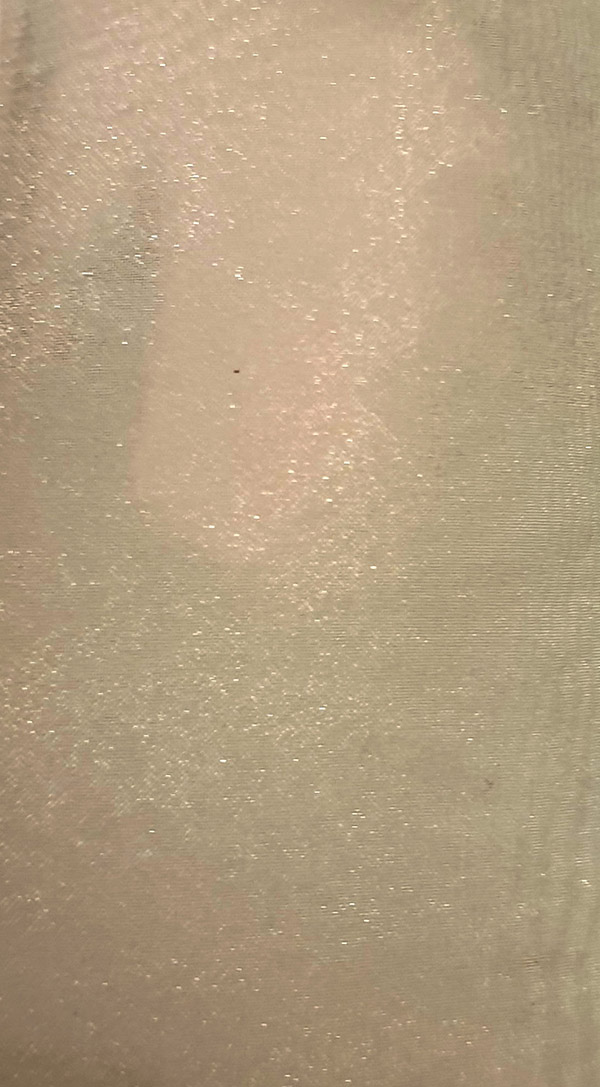
Transferring from commercial paper onto a print caused the two papers to weld together. A shorter press time resulted in the dye transferring beautifully onto the print. But when I printed it onto the scrim, the image wasn’t viewable.

I tested the process by printing onto synthetics, just in case I was doing it wrong; it worked beautifully. Unfortunately, that wasn’t the fabric I wanted to use.
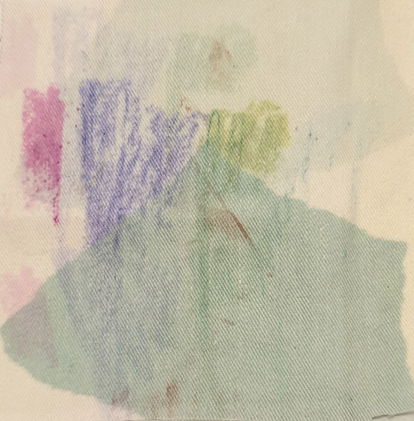
At this point I decided, very unhappily, to give up.
But then … in true creative spirit, I changed my plan. I decided to convey my message in a different way, going much more abstract, and was very excited by the results.
Sometimes we have a picture in our mind of how we want our work to look, and it can be hard to move away from that first idea. The challenge is to reimagine it, to rework it, when it becomes obvious that this initial concept will not be achievable in its original form. I changed my background from that idea of very abstract pieces of landscape overlaid with images, to four hangings, still abstract but vaguely representing the landscape of Spurn, showing how nature has changed it over the centuries.
So – not what I’d originally intended, but, I hope, something far more challenging.